


Leading the internal digital creative team for Burton I guided the brand through the transition to creating its presence in the digital world. Every year, riders would eagerly await the drop of the newly designed burton.com that showcased the seasons new gear, team, and of course incredible photos and video of snowboarding to get stoked for the season. The annual design of the site also set the bar for design across both snowboard and creative communities.
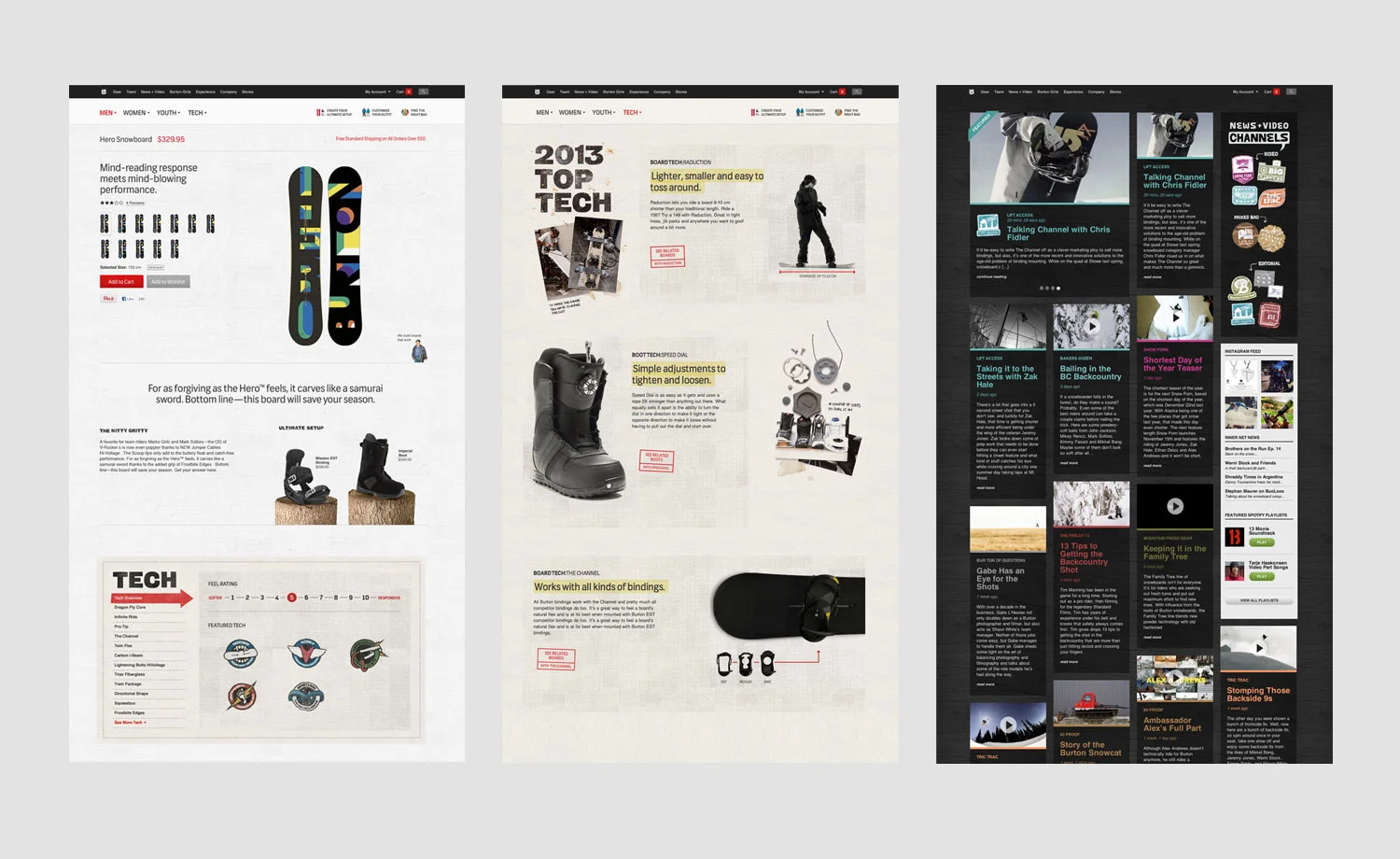
Product technology is the reason why burton is the world leader in snowboarding. No other company could come close to having an idea and creating a prototype that could be on snow less then 48 hours later. Each product category had it’s own major innovations of the year that were highlighted in the new “tech” section of the site. These pages were filled with amusing and sometimes surprising animations that put technology in plain words for the customer as well as educated them on the benefits.
Burton’s Blog also took a main stage. Working collectively with the newly formed media department that created articles and videos from the team’s experiences on the road enabled us to bring this content to life beyond what anyone in the industry had seen before.
This site had a ton of Flash components wrapped in a tight HTML shell. The layout of all pages was completely liquid adapting to any size screen. Considering today's push toward responsive design, the site was head of it's time in terms of adaptive layout/design. The gear section had an inventive navigation - a visual breadcrumb. Category pages had a horizontal nav and users could pull the nav "tab" at the top of the interface to allow for a quick scroll through the products. Developing a site like this was no minor project as developers and designers really had to wrap their head around not HTML tables and thinking linearly about the grid.
We poured some effort into a UI that blended both ecommerce and Brand in a functional, seasonally relevant model. The result was transforming the gear landing page that was formerly a banner farm into a huge, shop-able look book. We tagged all the products in the photo so that allowed users to shop each photo. In addition, this page acted as the main navigation for selecting a gender to start the shopping process.
I also did a lot of work to bring personality to the product pages. Gear pages are the most viewed on the site, so it made sense to put a lot of effort into both designing an engaging experience and presenting the information in a way that only burton can.
Search was also a huge redesign. Search UI's are generally small and results suck. We created the search layer - so when you clicked the little UI in the global nav, users were presented with a large search box they could immediately start typing in. The results were instant and appeared as a layer over any page of the site. Users could select a item from the results and go to the respective page or close out if they weren't interested. Also the search was cached in their history, so once you went to a page using search, it was a snap to get back.
Overall the aesthetic as very clean and focused and bit (dare I say) generic, which as a big departure from years before. The big breakthrough from a design perspective was the development of the grid system that could be adapted to all devices and screen sizes. The grid focused on prioritizing information and navigation.
Look Books and action photos were big this year. We created our own tagging system for all of our photos. With this backend tool, we could tag our photography with meta data containing the rider, location, and gear they were riding. We made an edit of about 300 photos and tagged them all with this info. This allowed us to create look books on the fly - mainly seen on product detail pages by serving up images of that piece of gear in action. The cool thing here was that we could also pull up images by gender, color, location and more creating an number and kind of lookbook on the fly.
Along the same thinking as dynamic look books, we also created dynamic product videos. By utilizing the youtube API, we uploaded all of our tech videos and wrote a query to a Flash front end video player that pulled individual tech videos and dynamically stitched them together to create product specific tech/feature videos.
The Outfitter was your guide to creating the ultimate outerwear setup. It recommended Burton outerwear based a series of simple questions based on color, fit and weather condition. Based on your specifications you could mix and match the recommended gear to create your perfect outfit. When you had your outfit dialed you can share it through Facebook, Twitter and Google and share it with others in the gallery.